Monday, 13 December 2010

Front cover research

For my front cover I want to have more then one person, preferably 3 at the most. The front covers below are all from different magazines that do this.

This magazine cover has three men all looking straight ahead. It is very simple yet effective. It gives them the sense of power and superiority over the reader. However, I do not think this kind of pose is one I will use for my front cover. This is because although it looks good I do not think it will work for the type of magazine I am making.
This one is very different in many ways from the above. Even though it has three men on the cover the whole structure is different. This one has a more lively colour and has a fun look about it where as the above was very serious. The picture has also been photoshoped a lot and made brighter which makes it look happier. The poses they are doing are lively which is what I want my 'band' to be like.

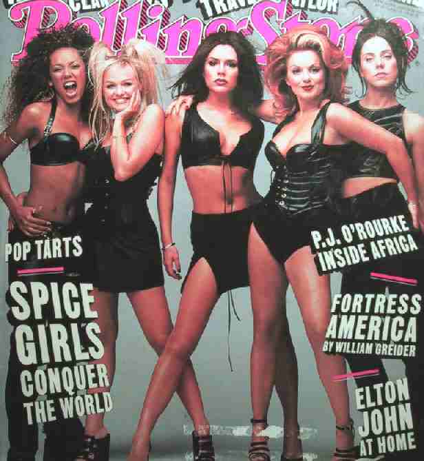
This is one of the only front covers that have a girl only group on the cover. I do not want my band to look like this as I feel it does not have the same effect as the picture above. You do not get the sense they are having fun or a very happy vibe from it. However, some of the characters have very good facial features that I want to use. For example the one on the left hand side has good facial features that are different from most. I will try and merge both this picture and the one above when taking my photos so it will look as though they will be having fun.

Music magazine

We have now moved on and about to start making and design and music magazine. Like the other magazine I will need to design a front cover and contents page, but I will also need to do a two-page spread after, which I will probably make a interview of a band. The front cover will be of a made up singer or band, most probably one or a few of my friends. I will need to find people that have the same skin tones so I can set the camera up and not have one person looking good whilst others looking slightly weird because the camera does not suit there skin.

Saturday, 27 November 2010

evalutation questions

In what ways does your media product use, develop or challenge forms and conventions of real media products?
My school magazine has all the same features that other school magazines have. For instance it has a photo of school children playing a sport looking happy, like many other magazines as it makes the school look better than that if it was unhappy children or just of the school. Also the title of the magazine is that of the schools so it is easy to see what school it is about. The contents page also has photos of the children attending the school. The two pages have the same type of colour scheme as the red and green colours of the text are from the two girls at the front (the bibs they have on). The text that is on the front cover stands out and is all about school subjects, nothing else.

How does your media product represent particular social groups?
It represents my social group as it is very informative about the school and what is happening. It has details of everything that a parent needs to know about the school and also how to get in touch with them. However it also has information about what is currently happening which the daughter of either a pupil looking to come to the school or one already attending would find interesting to read. I do believe it is mainly made towards pupils already attending the school as it has information about exam help, yet it can be read by others like parents.

What kind of media institution might distribute your media product and why?
I believe that the school itself 'Lilli's' will distribute my magazine as they will be able to hand it out very easily. This could be done either by giving in to the pupils in the register or handing them out in lessons, however children then may not give them to there parents as they forget. So the school could also send them out my post to the childs home. Also for the people that wish to read it that do not have a child at the school they could either put an internet version on their website or have a few copies in the office for parents to see and take if they visited the school.

Who would be the audience of your media product?
The audience of my magazine would mainly be for the students that go to school to see what is coming up such as events, have help with exams or certain subjects and to see how well there school is doing in compititions. Also it will have collums for them to write what they want in it as well so it will interest them. However my audience could also be for parents to see how well the school is doing.

How does it attract/address your audience? 
The picture at the front of my magazine is very eye catching as it takes up the whole page so you can see every detail in there facial expressions. This attracts my audience as they may know the pupils on the front and what to read more or they may just want to see what it is about. It also addresses the audience in this way because they are pupils from the school so they know who they are and not some random people. This is the same case for the contents page as there are two more photos or pupils from the school. The text also helps this as it is bright colours such as the red and green used on both pages.
What have you learnt about technologies from the process of constructing this product?
I have learnt very basic skills in both Photoshop and Indesign such and placing images, croping and the clone tool to remove the bin in the background and any rubbish on the floor. Also I learnt a little bit on how to take photos and how difficult it can be to get the photo you want. However because I had never used the programs before I felt proud of myself to be able to use tools and produce pictures that I have done.

Friday, 26 November 2010

Contents page

To go with my title page I also designed my contents page.
I have used the same colours from my front cover and placed them on my contents page. This is so it flows well. I also added in two more pictures of girls playing more football as it is what my magazine is based on. I feel that if I had more time I could have designed it better and made it look slightly more professional. However, I do think it does what I want it to, which is to show information clearly yet still be entertaining to look at.

Tuesday, 23 November 2010

Front cover

After editing the background on photoshop and researching front covers and titles, my final front cover design looks like this.

I have used the red colour from Charlotte's bib as the sub-heading colour. This is so all the colours link together and flow. Instead of using the purple as the heading I went with a plain white. This is because it stands out a lot better and the purple clashed with the green background when I put it on there. The white also links in with the football. I think my front cover looks quite realistic and like a school magazine cover and quite proud of it.

Thursday, 4 November 2010

Photoshop

I think this photo is the best one out of both photo shoots I did. It has the ball centered in the middle at the bottom then two people running after it and looking very happy. The problem with this photo is it has the bench and bin in the background. Hopefully I will be able to get rid of them in Photoshop and brighten the background slightly so it can be used as my front cover.


This is the photo after I have edited it on Photoshop. I have managed to remove the table, bin and also any small pieces of rubbish that where on the floor. I also zoomed in on them so you can see there expressions clearer. When I use this for my front cover I may crop it down more so I only have them and the ball in the picture and not as much greenery. But I may on the other hand keep it as it is because I will be able to use it as the whole background and there is a lot of extra space around Josie and Charlotte for my title and other pieces of text.

Wednesday, 3 November 2010

Contents page research

I do not like this contents page because although it is very clear and easy to read  I feel like it should have a picture of some kind to show what the contents page is for. Or if it does not have a picture of some kind it needs to have a bit of colour put around the edges or in the text. I do however, like the font as it is big, bold, and stands out so it is very easy to read and understand.


This contents page however is the opposite from the one above and has too much going on. Although you can see in the top right corner what is on each page page it is not clear and easy to read like the above one. If the text was bolder and bigger however, I think it would be better because then it would be easy to read but also it would not be plain and you would be interested in the page.


This is a contents page for a music magazine and I prefer this one to the other two. This is because its not plain and it doesn't have lots of pictures on the page. Also its easy to read and understand where specific things are in the magazine because of the sub-headings. It also has 6 small pictures on the side so its not full of text, which would be boring. In my magazine I would want to make the contents page like this because it is easy to read and has a design to it which makes is interesting to look at.


Monday, 4 October 2010

Name design

These are my first ideas for my title name. On the left hand side I decided to try and keep to the bold sizes whereas on the right is the smaller skinnier versions. I personally prefer the bolder ones as they will be easier to see and stand out a lot better on the front cover. Also the designs on the right hand side will not catch the eye of people whereas the bolder ones people can see easily and clearly. 


I decided to stay with the bolder designs and then used each design and put a different colour with each design. I only used the basic colours and not different shades of the same colour as I wanted to see which colour would best suit my magazine. I think the purple colour would suit my magazine cover the best as it is for a girls school, also the colours will stand out against many background colours.


I chose 4 designs from the previous designs and kept with the purple theme. I added two extra shades of purple so I have a variety of colours for me to choose from. I like the second design the best as it has more shape to it. Also I like the darker purple colour as it will stand out more on the cover.


Monday, 27 September 2010

Front cover ideas.

I've started looking on the Internet for sports pictures as I have changed my magazine to a sports themed school. I did this as I feel the pictures I could take would be more interesting and better. Here are some pictures I found on the Internet.

This picture caught my eye because you can easily see what the child is playing and because it is a mid-shot picture and not acted it is more believable. Also the picture quality is very good as you can see where the sun is because the shadows are clear and you can see every detail. I think it would be suitable for a front cover as well because in the middle you have the child playing but all around him there is free space for titles and headings to say what else is in the magazine.


This picture is slightly closer that the one above and I think it looks better as you can see the emotion in the children's faces. Also I like the picture angle as it looks as if you too are in the middle of the game with them. The picture quality is very good as well as you can see every little detail as the lighting has been thought about. I think I could easily use a photo like this in my front cover as you can easily see what is happening and there is just enough space around the main focus of the picture to but titles and headings. If I were to do a picture like this though I would try and get a little more space around the outside so it would be easily to arrange the lettering.


I do not think a picture like this would be suitable for my front cover as it is too plain and there is too much free space around the picture, Also because there is lots of light and dark colours it would be very hard to find a colour to stand out. Also because the picture is landscape it would not fit onto the magazine cover, so I would have to change the picture to portrait if I were to use a picture like this. I also would prefer it in the focus was more on the two players in the middle.


From looking and researching sports pictures I have decided to try and capture pictures of people playing football as you can get good close ups of one or two people or I would get pictures of the whole team playing, I will try taking pictures of both types and see what will look best.
I do not like this for many reasons. First of all the writing on the front cover is very small and not easy to read as it is white on a colourful background. The title itself is very plain but overpowers the cover at the same time it also does not tell us what the magazine is about. The picture is not very good either as it could give the impression of the adult about to hit the boy rather then the photo making us feel like it is a loving pair  
                                                         

 I like some aspects of this, such as the picture being the main focus of the cover and that it is relevant to the magazine. Also the fact that there is so blank spaces on the cover, and everywhere you look there is something to read. One problem I do have with the design is that there are too many colours that clash with each other. Also I think the font should be kept to one or two different ones instead of using lots of different ones as it will be easier to understand.


I like the style of this magazine as the title is big bold and catches your eye. Also the pictures show what the magazine is about and are the centre of the cover. The colours of the font and the font itself is good as it is very easy to read and because there are not lots of colours you can concentrate on one bit without getting distracted with all the colours like in the magazine cover above.

Monday, 13 September 2010

Blog design

At first I thought the design for my blog was good but now I look back I can see that all the colours overpower the actual blog and you cannot read it properly as you keep getting distracted by the colours. Also all the extra links stood out and did not look right.
Hopefully with my new design it is easier to read and understand and all the unnecessary links have been removed. Although it still has colour, I have kept it to only a few and not lots of colours so the interest is more on the blog itself and not the background/picture.

Tuesday, 7 September 2010

School – Lillie School for Girls.
Built in the 1960’s.
Around 600 pupils.
Used to be a house but turned into a school, including all the servants quarters.
There is one main part of the school which most subjects take place, then there are several smaller buildings around.


Target Audience – Teenage girls and there parents


Type of school – sports academy


Location – East London

Monday, 6 September 2010

First Media lesson ever.

Today I had my first Media lesson, at first it sounded as though it would be an easy lesson to do. But after the first 10 minutes I found out it was going to be a lot of work and at some times hard. Even though it may be hard it sounds as though it will be good fun to do and I will learn lots of new things. As I was making my Blog I found it very interesting to change the layout to see what works the best and which colours go well together. I'm looking forward to making magazines and taking photos in the next few lessons.